Web design review
13-Mar Update
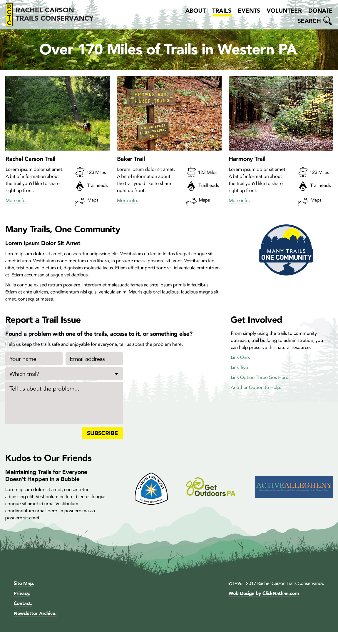
Initial design for trail pages

9-Mar Updates
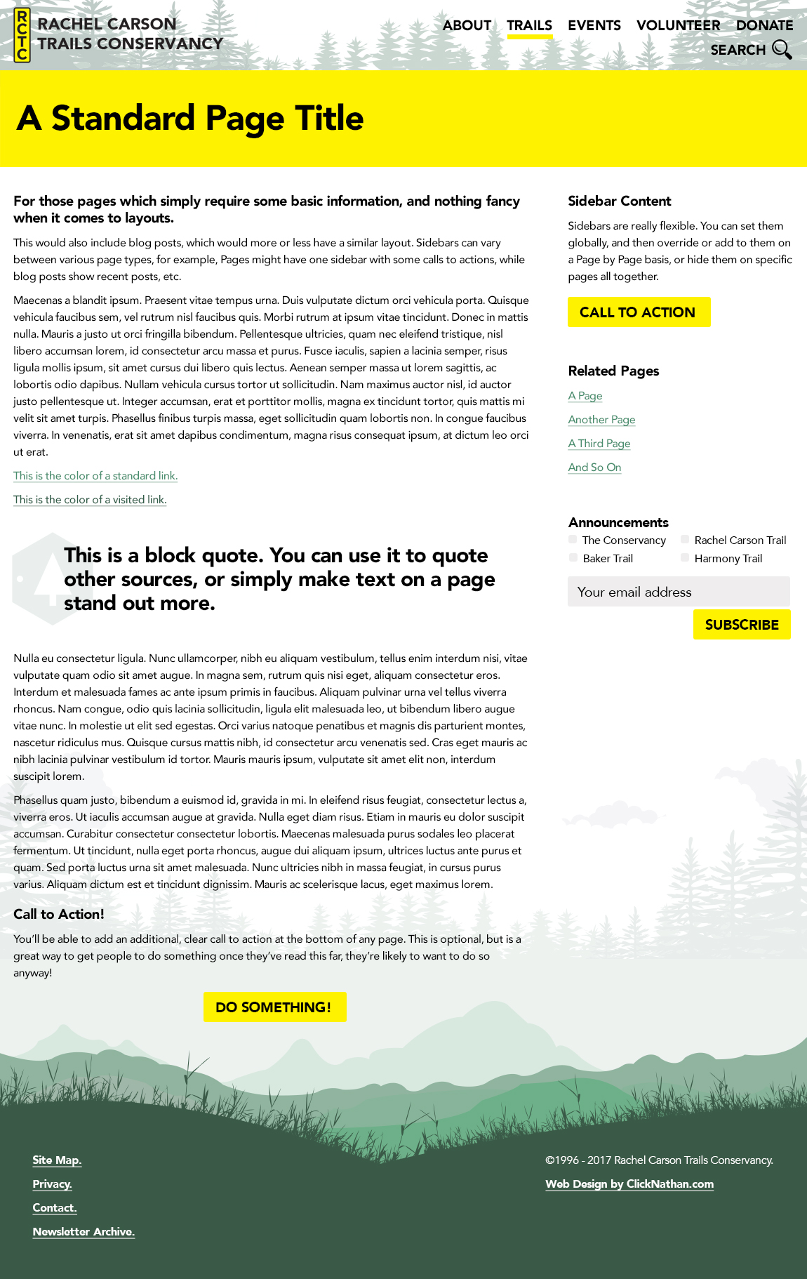
Initial internal page and landing page designs.
Internal page:
Landing page:
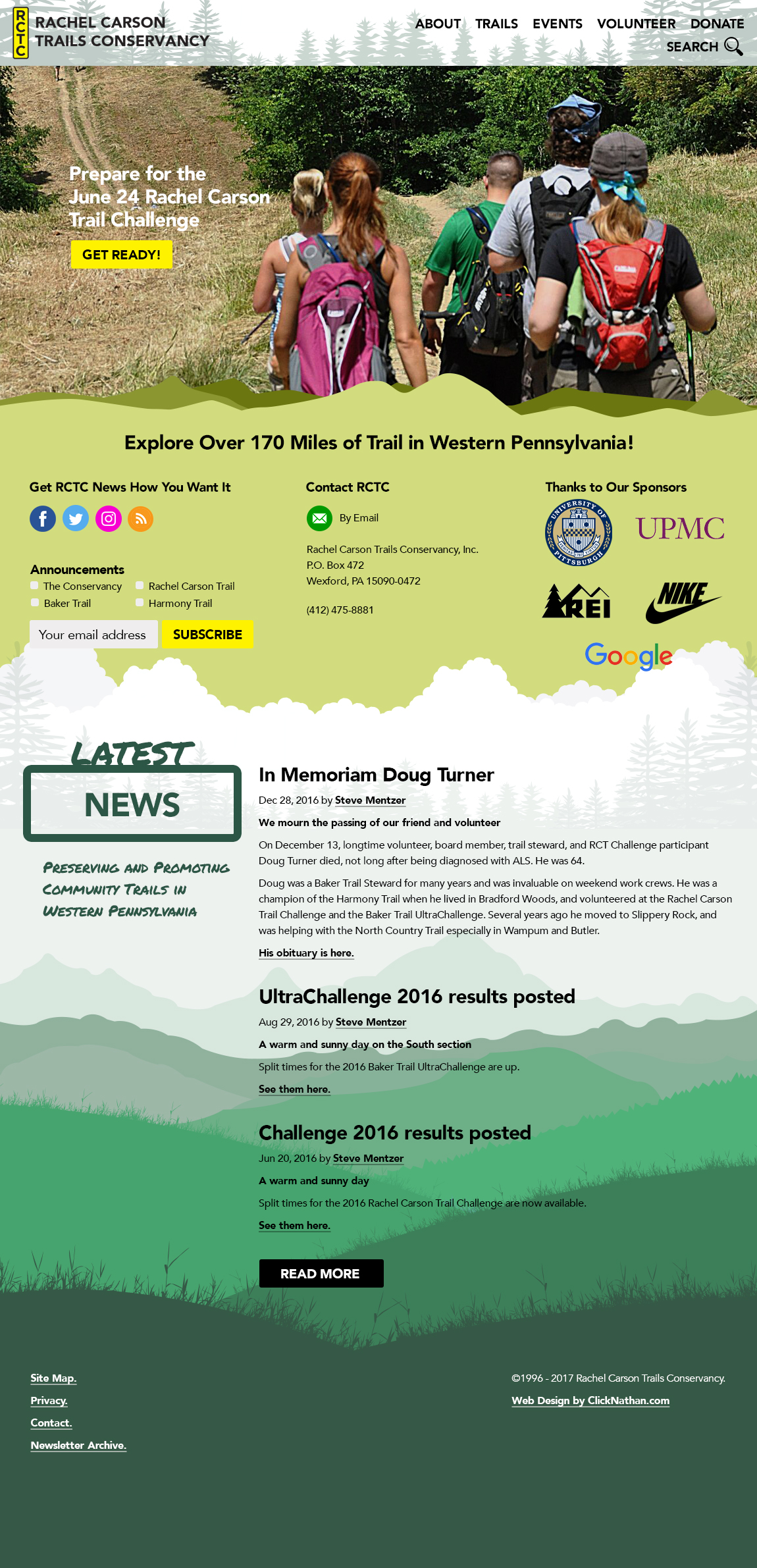
28-Feb Revision
Hero image text clarified, search bar added, removed labels from social block.
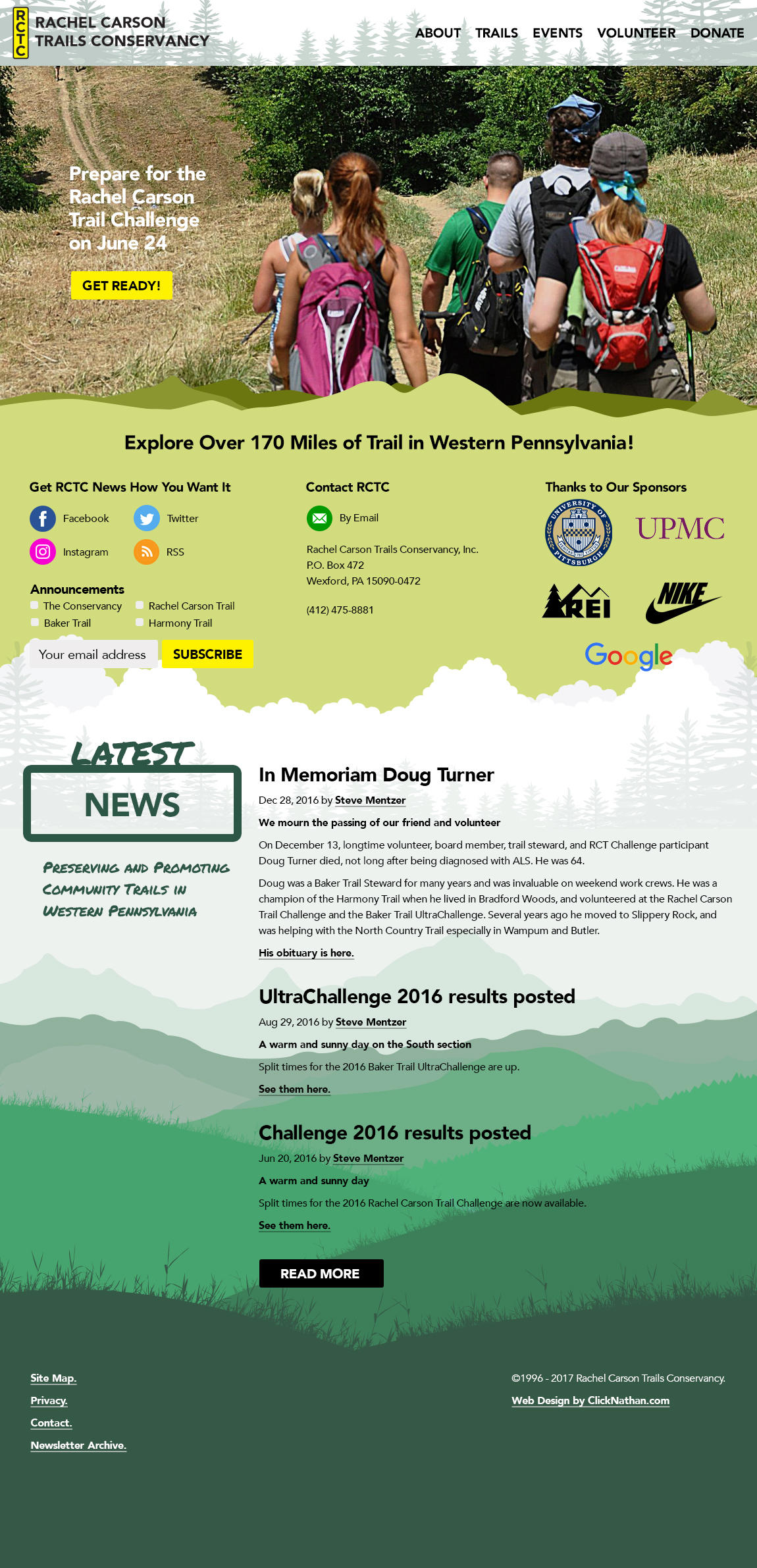
27-Feb Revision
Hero image text changed.
24-Feb Revision
Hero image text size reduced and changed to "Prepare", trail miles corrected.
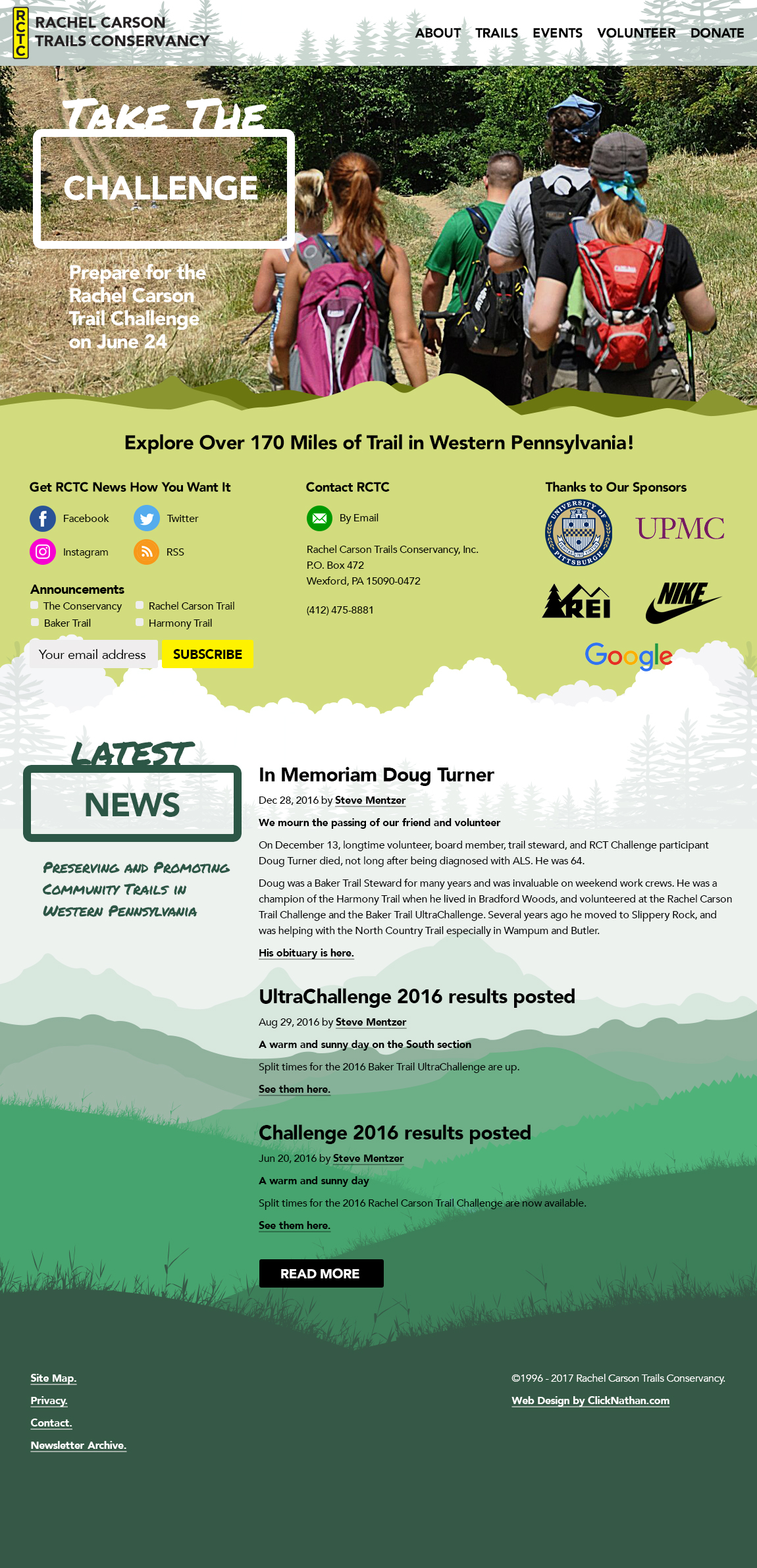
23-Feb Revision 2
Hero image size reduced.
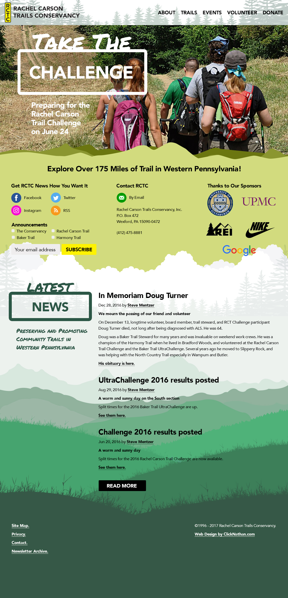
23-Feb Revision 1
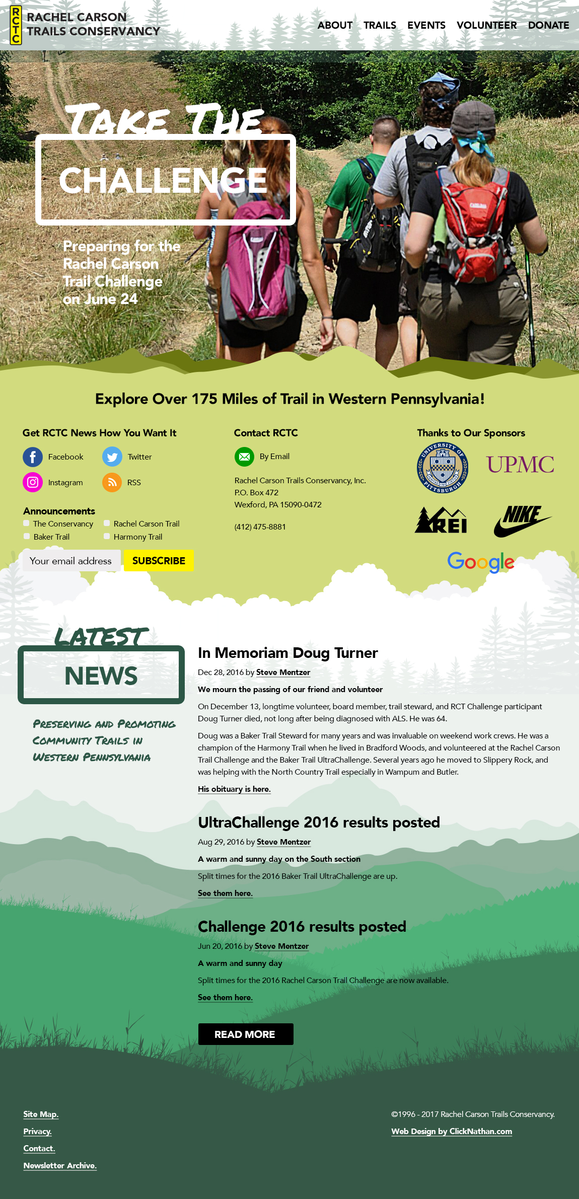
20-Feb Design Review
We met and reviewed the initial design. We like the overall look and have this feedback.
- Move the background (from around "Stay Informed") up to the page top so it encompasses the entire page. The top menu and our logo don't seem to be part of the page, they appear somewhat separate.
- We prefer text for the main menu topics, like on the new KTA site (note the menu text color on this site doesn't contrast enough with the background image)
- The main menu items should be in order: About, Trails, Events, Volunteer, Donate
- The hero image should be static, but changeable to one of four seasonal images throughout the year. The text should emphasize our 175 miles of trail.
- Below the hero image, from left to right, should be three blocks: social icons plus newsletter signup/archive, contact email link, and space for up to 5 logos for our annual sponsors
- Below the blocks should be the newsfeed and our mission statement.
- Correct our name in the copyright text
The main menu dropdowns:
About
- What we do
- Karma
- Newsletters
Trails
- Rachel Carson Trail
- Baker Trail
- Harmony Trail
- Many Trails, One Community
- Report a trail issue
- Friends [North Country Trail, Get Outdoors PA, Active Allegheny]
Events
- Upcoming events
- Rachel Carson Trail Challenge
- Baker Trail UltraChallenge
- 100 Mile Quest
Volunteer
- Join a work crew
- Become a trail steward
- Help at an event
- Lead a hike
- Join a committee
- Report your hours
- Check your karma
Donate
- Make a donation
- Sponsor the Conservancy
- Become a Conservancy member
Here is a sketch of the layout:
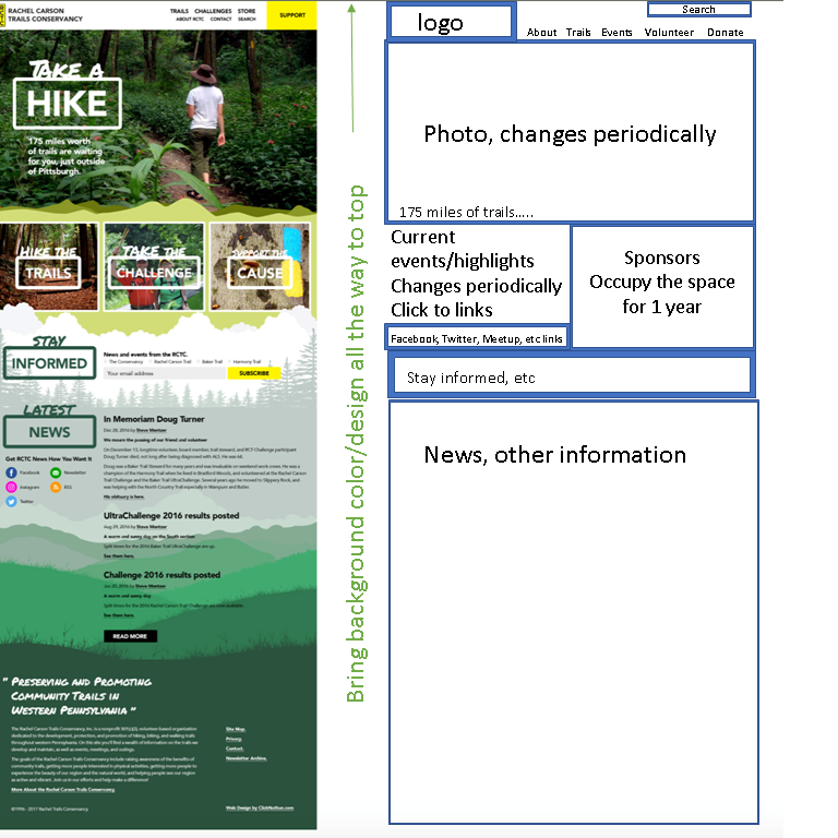
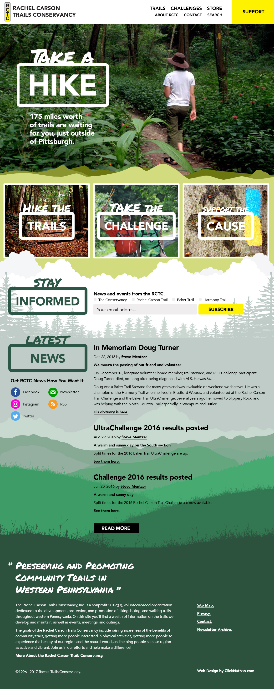
Feb 10 mockup
Previous feedback
Steve:
- Replace "Challenges" and "Take the Challenge" with separate images/links for the Rachel Carson Trail Challenge and the Baker Trail UltraChallenge
- Not sure the Avenir font is the best choice, outside of the logo
- Need places for new things, like the Quest (image of the patch)
- "175 miles worth of trails are waiting" -> "175 miles of trail are waiting"
- Need "Calendar" or "Events" or "Schedule" or similar for upcoming events
- "About RCTC" -> "About"
- Remove quotes from our mission statement
- Remove periods from links near bottom
- Use image of just a yellow blaze under "Cause" (blue is not one of our trails)
- Incorporate karma site (login)
- In general I like this. I like the rolling hills and colors a lot. And it look sufficiently different from all the the ones we gave him as example.
- Maybe instead of "Take the Challenge" that could be the “EVENTS” links. While the Challenge is our biggest event, we are having many more and maybe we didn’t want this to be Challenge website.
- LOOKS GREAT!
- Is there a link to the web site in test? Would be much easier to view the site in test mode - and provide feedback. The screen cap embedded in the original message is small and does not lend itself to comprehensive feedback. Plus, I can’t get a sense of how much of the first page scrolls.... what’s linking... etc...
- I agree with Donna on changing the wording of “Take the Challenge” to something else, perhaps Events. Naming it “events" will give more visibility to other less popular events -- more traffic goes through...thereby increasing participation in the many other events.
- Is there a spot on the page for “Who we are” -- (Board members, Trail Stewards, etc)
- Is the take a HIKE (BIG graphic) meant to be a link to sub page? Depending on the answer, my vote would be to reformat so “Hike” doesn’t look like it’s a button. And make it NOT a link.
- Rather than THREE MAIN headings -- make it 5 headings... more “big name categories” to choose from so that there’s not a lot random links in the bottom half.
- eliminate the text in the lower half of the screen. The text below is distracting and confusing. Takes away from the simplicity and beauty of top half. (And by Text, I mean the headers like “In Memoriam” Doug turner story and so forth. )
- In summary -- I’d like to spend 20 minutes on the BIG BUCKETS (as I like to call them) What are the main menus everyone wants and what info will fall into those buckets. We could even use a WORD DOC. to illustrate this.
Nothing at this stage is code, all Photoshop and thus the jpg. You can see the image full-size here: https://clicknathan.com/wp-content/uploads/2017/02/design.jpg
You may have to hover over the image until you get a magnifying glass and click it to be 100% size depending on your browser. Note that many elements will be full screen, up to a certain screen size (we don't want to have massive elements for folks who have giant Mac screens, for example).
Replies to the input from Amy below!
1) Is the take a HIKE (BIG graphic) meant to be a link to sub page? Depending on the answer, my vote would be to reformat so “Hike” doesn’t look like it’s a button. And make it NOT a link.
Yep, the entire Take a Hike section would be a link to the main Trails page. This could also be changed over time, so that it pointed to whatever you wanted to promote at the time, be it the challenge or some pertinent volunteer opportunity, donations, etc.
2) Rather than THREE MAIN headings - make it 5 headings... more “big name categories” to choose from so that there’s not a lot random links in the bottom half.
If you've got 5 main calls to action, just let me know what they are!
Typically though, you don't want to give people infinite choices, but focus on your main goals. I chose these three based on conversations with Donna, Steve, various similar websites and what I thought were your main goals with the site. We can certainly add more though! And over time you can add as many as you'd like, really (though my notes above still withstanding).
3) eliminate the text in the lower half of the screen. The text below is distracting and confusing. Takes away from the simplicity and beauty of top half. (And by Text, I mean the headers like “In Memoriam” Doug turner story and so forth. )
Again, certainly able to remove this. This text will do the following, though, if it wasn't clear:
- Show the latest three "blog" or "news" items, giving the homepage fresh content.
- Give you more of a chance with showing up in Google results. Right now, searches like hiking trails in pittsburgh, hiking trails near pittsburgh, hiking trails in western pennsylvania, you don't come up for at all on the first page.
Same with the text in the footer.
4) In summary - I’d like to spend 20 minutes on the BIG BUCKETS (as I like to call them) What are the main menus everyone wants and what info will fall into those buckets. We could even use a WORD DOC. to illustrate this.
Certainly! Feel free to send any additional info on the site structure you might have / want! I would still mention that it's best to keep things simple, direct people to what you want them to find vs. giving them every possible option. :)
Doug:Important to me on the "Face" page....tabs that take you directly to the following:
- Become a Sponsor
- Donate
- My Karma Account
- Training Hikes
- Rachel Carson Challenge 2017
- Baker Challenge 2017
- Current projects (bridge building, trail work, community trails campaign)
Also, space for ads and sponsor names, corporate logos, etc. We are promising PR when soliciting sponsors. They need to see their recognition.
Bob:Things we may want on the web site (an * means it should be on the first page; yellow means it is already in the mockup, green means we should consider it for the first page)
Our name*
Our logo*
Trails*
Events (currently says Challenges)*
Store* are we selling trail guides, old shirts, memberships, hats, patches, decals? Is this the best way to make memberships available?
About RCTC* At the bottom of the mockup there is a presumed link that says “More about the Rachel Carson Trails Conservancy”. Do both of these links go to the same place? If not what information goes to each link. In talking about ourselves we might show:
Our history
Current information like our address, nonprofit status, number of members (if we have a database of members on the site we can get this number to dynamically update. Past committee minutes – perhaps with a password to limit access
By laws
List of Board Members
List of Committees and Members
List of Stewarts
List of Members
Contacts*
Search*
Support* what are we putting here? This is a pretty prominent place, can this be moved to the bottom? This might be a better site for “Trail Alerts”.
Logos from our paying sponsors and links to their site*
Logos and links from the groups we belong to or support (Like KTA, NCT, Allegheny Parks etc.)*
Main Picture with the wording “Take a Hike”, how do we decide what this links to and ensure we keep it up to date?
Hike the Trails* (brings one to links to info on all 3 trails. Do we have information about past events here listed under the appropriate trail or do we have a section for past events? Where do we show the pictures from past events? Do we do it on this site or use a link to another site, like Facebook or Flicker? Do we have pictures in multiple sites? Will we have different people or committees responsible for keeping the information on each trail updated?)
Where does the Many Trails – One Community initiative get covered?
Where does the hike 100 miles in 12 months initiative get listed?
Do we have any landowner information or a link to information for landowners on the website? We can find information on sites like the Western Pennsylvania Conservancy that has legal information for landowners and link to it for our landowners.
Notification about the trails*, we may be able to address this in the news section that apparently pulls for a blog but we need to consider how we make this very obvious to a visitor if it is critical information. We have carried notifications about bear sightings along the trail and of problems on the trail.
Hikers notify us of problems encountered on the trail* such as blow downs, encounters with unhappy landowners or trash dumped on the trail. Do we just leave this to the contact information we have buried on the site or do we put something on the first page soliciting the information?
Take the Challenge* may change to Find an Event or just Events (if we do that we may change Hike the Trails to just Trails) – (Links to all of our events including seasonal and training hikes – could we put the calendar in here?)
Support the Cause* (brings one to links to sign up for membership, volunteer for events, donations, sponsorships. Can we say something about how to join a committee? Should signing up for memberships be here or in the store? Perhaps information here with a link to it in the store. Can we list the current volunteer opportunities and the kind we anticipate over the year? Can we list the kinds of things we accept as donations in kind like advertising, food, drink, consulting, donations of tools etc.?)
Where do we cover the functionality for recording volunteer hours and the link to My RCT – Karma etc.?
Stay Informed* (ability to sign up for newsletter although it does not seem that clear to me from the mockup there appears to be the ability to sign up for a newsletter for the Conservancy and for each of the 3 trails because there is a hard to see little box by each. I don’t think we have that many newsletters so do we intend to send other information to the people that sign up? If we are sending out notices, reminders etc. do we call that something other than newsletter? Is our level of distribution enough to justify separate lists? What would be so bad about sending what we sent to everyone?)
Latest News* This gets fed from a Blog. See not above about notifying people of current problems on the trail
Get RCTC News how you want it* do we give up too much space to list the usual suspects? Could we make the page cleaner by making the heading a dropdown that then shows the usual suspects?
Site Map*
Privacy* do we have a privacy policy?
Contacts*
Newsletter Archive* I am not sure this needs to be on the front page although I am not against it.
More about Rachel Carson Trails Conservancy* see notes above asking about the difference between this and the About Us section
Our copyright*
There is a background of green and gray interlocking hills behind the “Latest News” section. These look OK as is but they are not striking. Would there be any way to put the scar of a trail winding through a section of them?
There is a main picture and pictures behind the text in the 3 main buttons. Can we change these pictures when we want?
Our mission statement and the 2 paragraphs below it are good.
Our current site has a section of Media Assets which may be new. Are we going to have a section like this or a section that links to articles that talk about us?
We have had a link to other similar events or hikes on our site. Are we going to continue to link to other trails and events? If so where?